Case Study
Pay4me Website Redesign
Case study
Work
Web Design
Industry
Fintech
Year
2025
Role
UI/UX Designer
Project Description
I embarked on the Pay4Me project to redesign a cross-border payment app that facilitates tuition and fee payments for educational institutions, businesses, and government entities in over 120 countries. The original interface was outdated and confusing, hindering user engagement and failing to resonate with its diverse audience of international students and immigrants. My goal was to transform the user experience by creating a modern, intuitive, and inclusive design that clearly communicated the app’s core value.
Key Stakeholders: Licensed money transmitters, banking partners, student loan companies, immigration firms, and educational institutions.
Target Users: International students and immigrants seeking reliable, cross-border financial services.
Project Details
Timeline
From Research & Planning to testing, refinements & launch in 2 weeks while working with multiple projects at the same time
Background
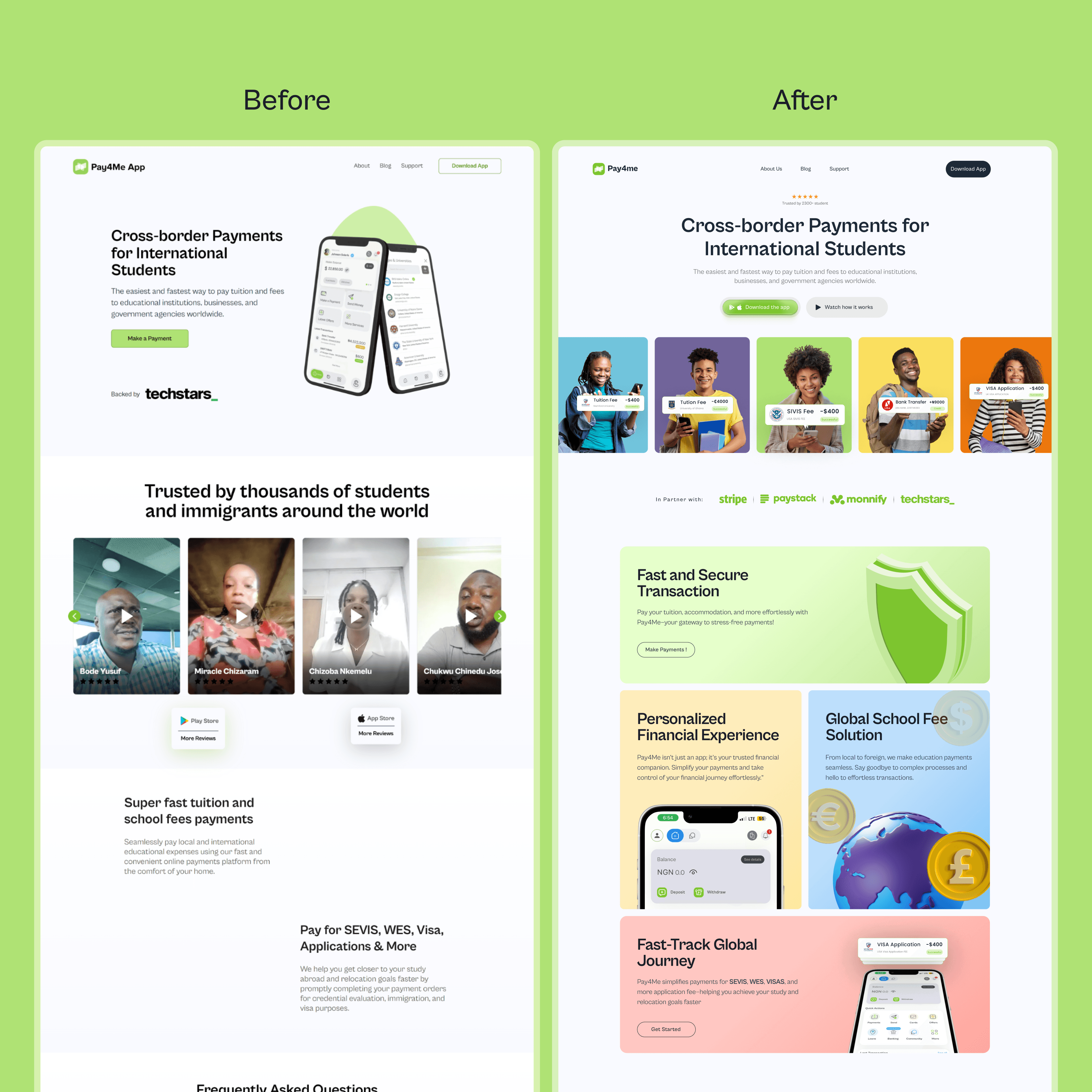
Before the redesign, Pay4Me struggled with:
An outdated design that did not instill trust
Confusing navigation that left users unclear about its value
A lack of visual engagement for its diverse audience
In an industry where trust and ease-of-use are paramount, addressing these challenges was essential to improving user satisfaction and strengthening the app’s market position.
Process
My approach was rooted in a user-centered design philosophy and involved a structured, step-by-step workflow:
Process Details
Research & Planning
Conducted surveys, interviews, and usability tests with the target audience.
Uncovered critical insights:
Need for a clear visual hierarchy
Intuitive navigation
Relatable imagery reflecting diversity
Design & Prototyping
Utilized tools like Sketch and InVision to create modern, minimalist prototypes.
Iterated on typography, color palettes, and call-to-action (CTA) elements.
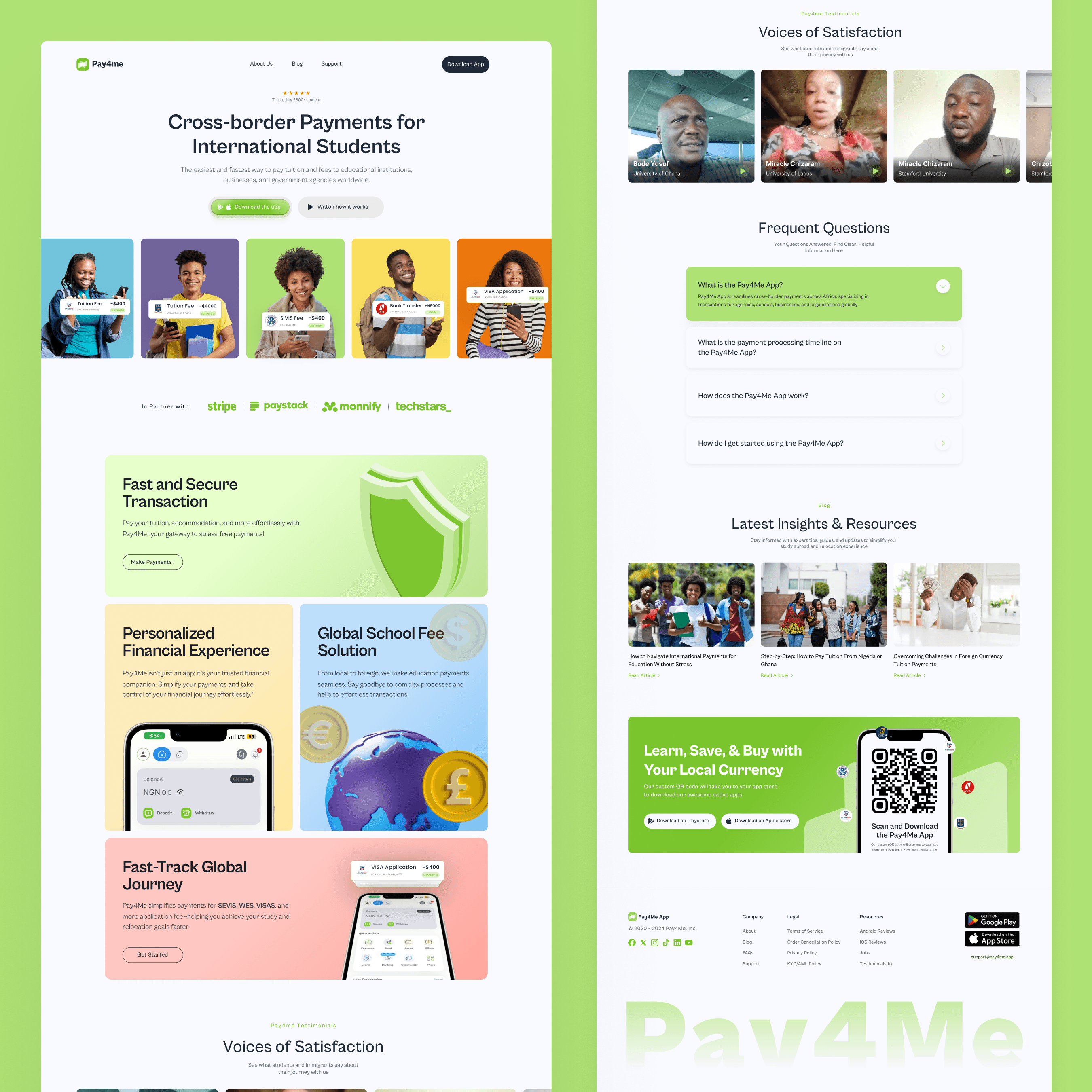
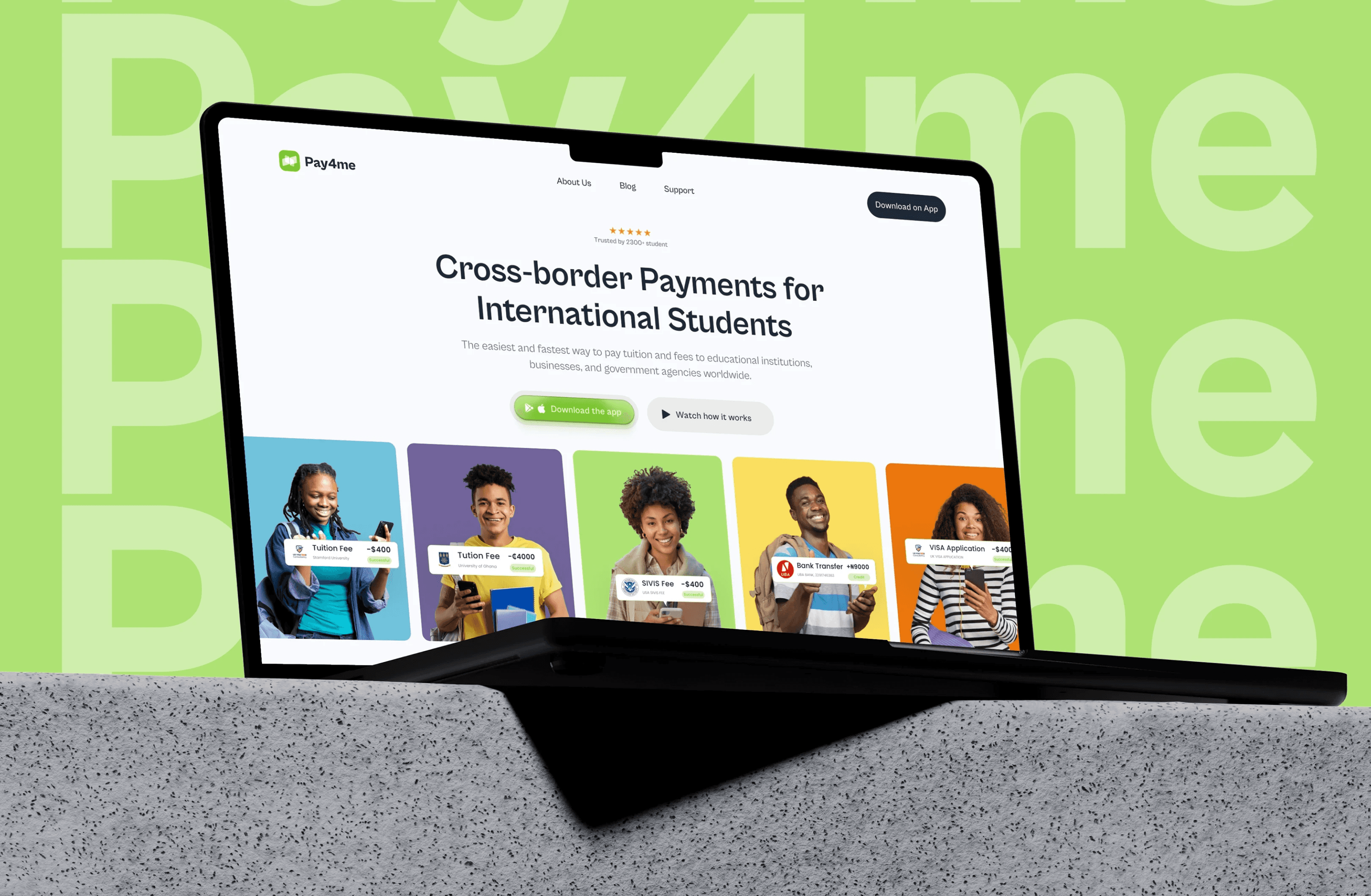
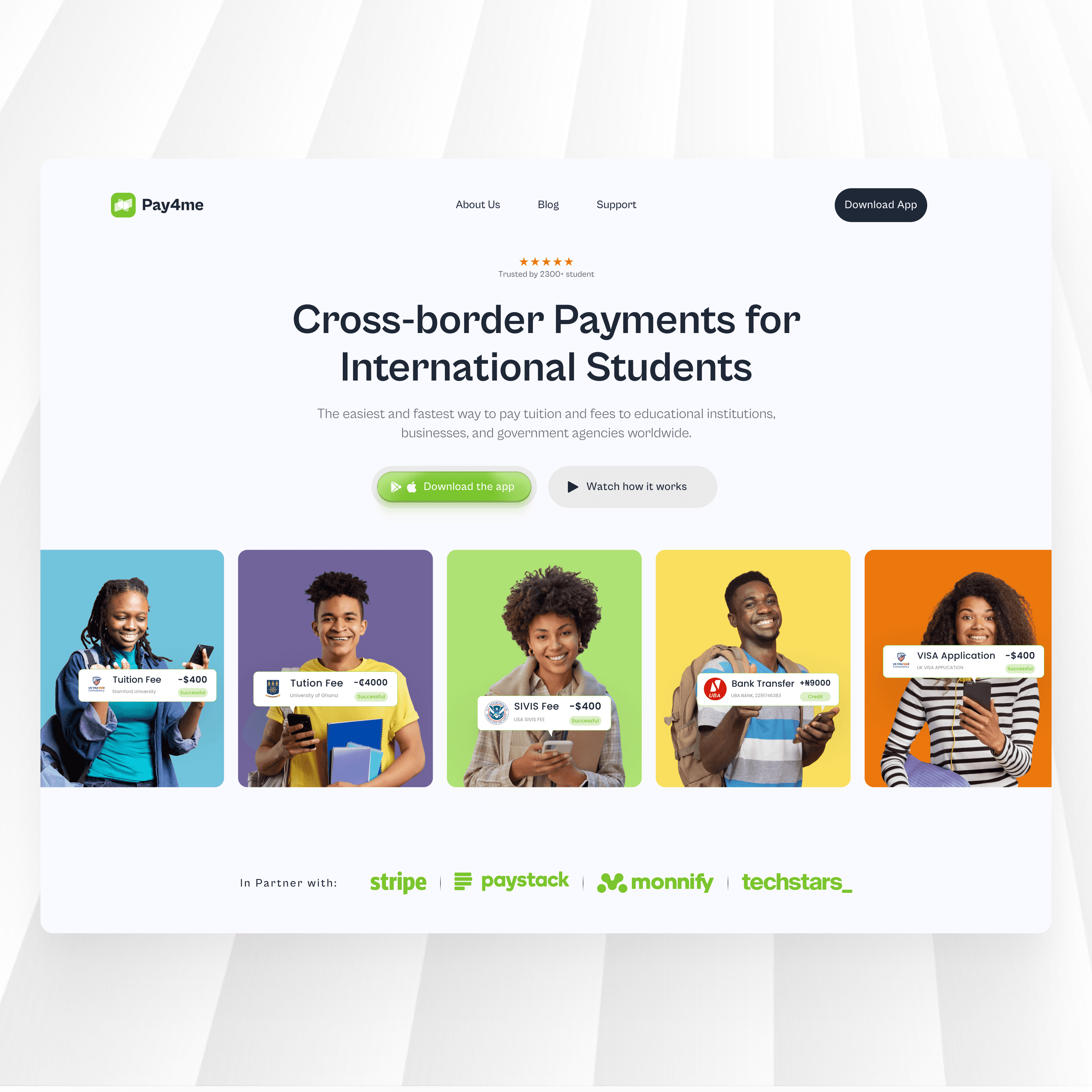
Redesigned the hero section to feature:
A bold headline
Two prominent CTAs: “DOWNLOAD THE APP” and “WATCH A VIDEO”
High-quality images of diverse, smiling individuals to enhance relatability
Development & Implementation
Working closely with the development team, I ensured that the refined design was faithfully implemented into the final product. Through continuous testing and iterative improvements, I resolved usability issues and optimized the interface to deliver a smooth and engaging user experience.
Solution
I delivered a redesigned Pay4Me app with a clear, modern interface that directly addresses both user and business needs. The solution revolves around:
Solution Details
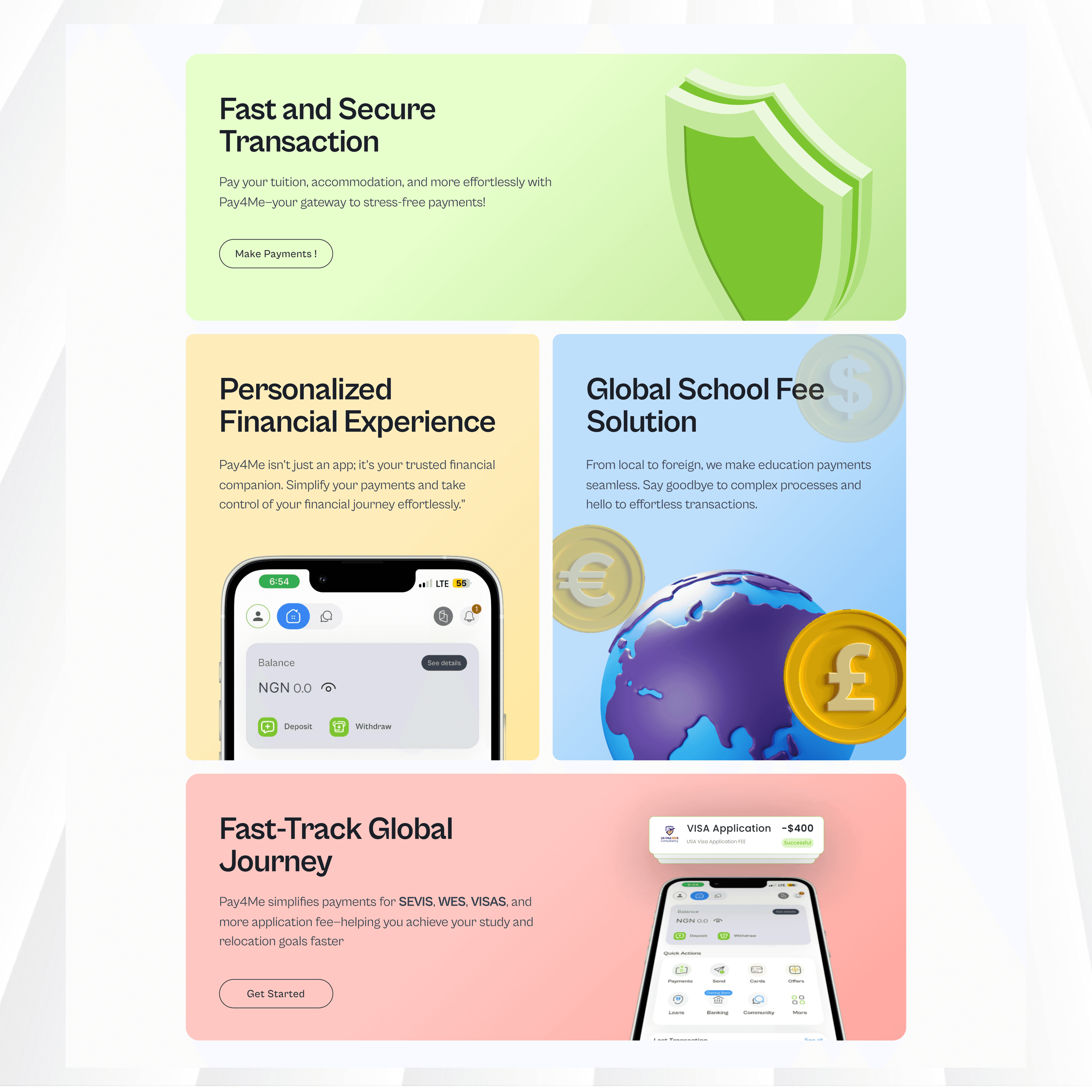
Strong Visual Hierarchy:
A bold headline immediately communicates the app’s value. Strategic use of color and icons differentiates key features and guides users to action.Enhanced Hero Section:
The hero section now prominently features two CTAs that capture user attention instantly, reducing hesitation and driving immediate engagement.Inclusive Imagery and Minimalist Aesthetic:
High-quality images of diverse, smiling individuals humanize the platform, while a modern, uncluttered layout with ample whitespace and subtle gradients creates an inviting look.
This design not only streamlines navigation but also reinforces the app’s commitment to inclusivity and reliability, ensuring that users understand the app's value at a glance.
Results
The redesign has significantly impacted both user engagement and business performance. Key outcomes include:
User Engagement: Increased by 35%
Conversion Rates: Rose by 25%
User Feedback: Overwhelmingly positive, with users appreciating the clean design, intuitive navigation, and inclusive approach
These improvements have strengthened Pay4Me’s competitive position in the global education payment market and enhanced overall user satisfaction.
Conclusion
Working on the Pay4Me redesign was a transformative experience that underscored the power of a user-centered, research-driven approach. I learned that clear visual hierarchy, intuitive navigation, and inclusive imagery are essential for converting first impressions into meaningful interactions. This project has not only contributed to my professional growth but also provided valuable insights for future projects: always prioritize the user’s needs and ensure that every design decision supports the overarching business goals.