Case Study
Tace App
Case study
Work
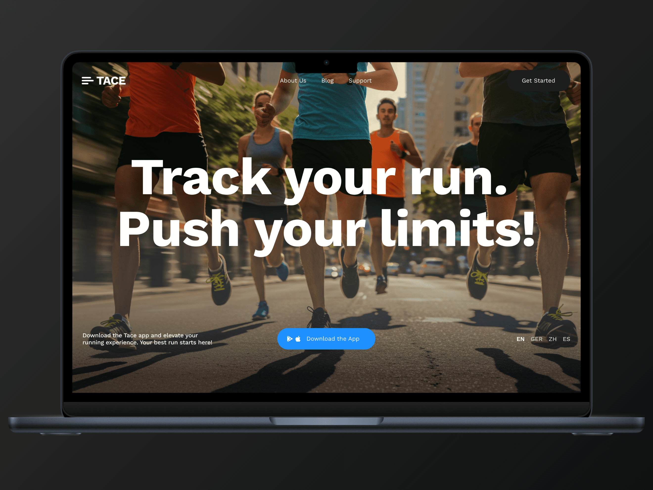
Web Design
Industry
Health
Year
2025
Role
UI/UX Designer
Project Description
This project focused on designing essential screens for a running tracker app, a mobile application aimed at helping users monitor their running progress, set goals, and stay motivated. The app targets runners of all levels, from beginners to advanced athletes, providing real-time insights and challenges to enhance performance.
My role in this project was specifically to design the splash screen, home screen, running tracker screen, and select challenge screen—critical touchpoints in shaping the user experience. These screens set the first impression, guide users through the app, and ensure a seamless interaction with tracking and goal-setting features.
Project Details
Timeline
From Research & Planning to testing, refinements & launch in 1 weeks while working with multiple projects at the same time
Background
The fitness industry has seen a rise in mobile applications that help users track their fitness journeys. However, many running tracker apps struggle with onboarding engagement, intuitive tracking, and goal-setting clarity.
The goal of this project was to create an experience that not only helps users track their runs but also keeps them motivated to achieve their goals. The challenge was ensuring that the first impression (splash screen), app navigation (home screen), progress tracking (running tracker), and goal selection (challenge screen) were intuitive and engaging.
Process
To design these key screens, I followed a structured user-centered approach, focusing on:
Understanding user behaviors through research
Creating a visually engaging UI to boost motivation
Ensuring intuitive interactions for seamless navigation
Optimizing for usability and accessibility
Process Details
Research & Planning
User Research:
Conducted interviews with runners to understand pain points.
Discovered that many users find existing running apps cluttered or uninspiring.
Identified a need for simplified goal setting and engaging tracking visuals.
Competitive Analysis:
Analyzed leading fitness apps to identify best practices and usability gaps.
Found that motivational elements and clean UI improve user engagement.
Design & Prototyping
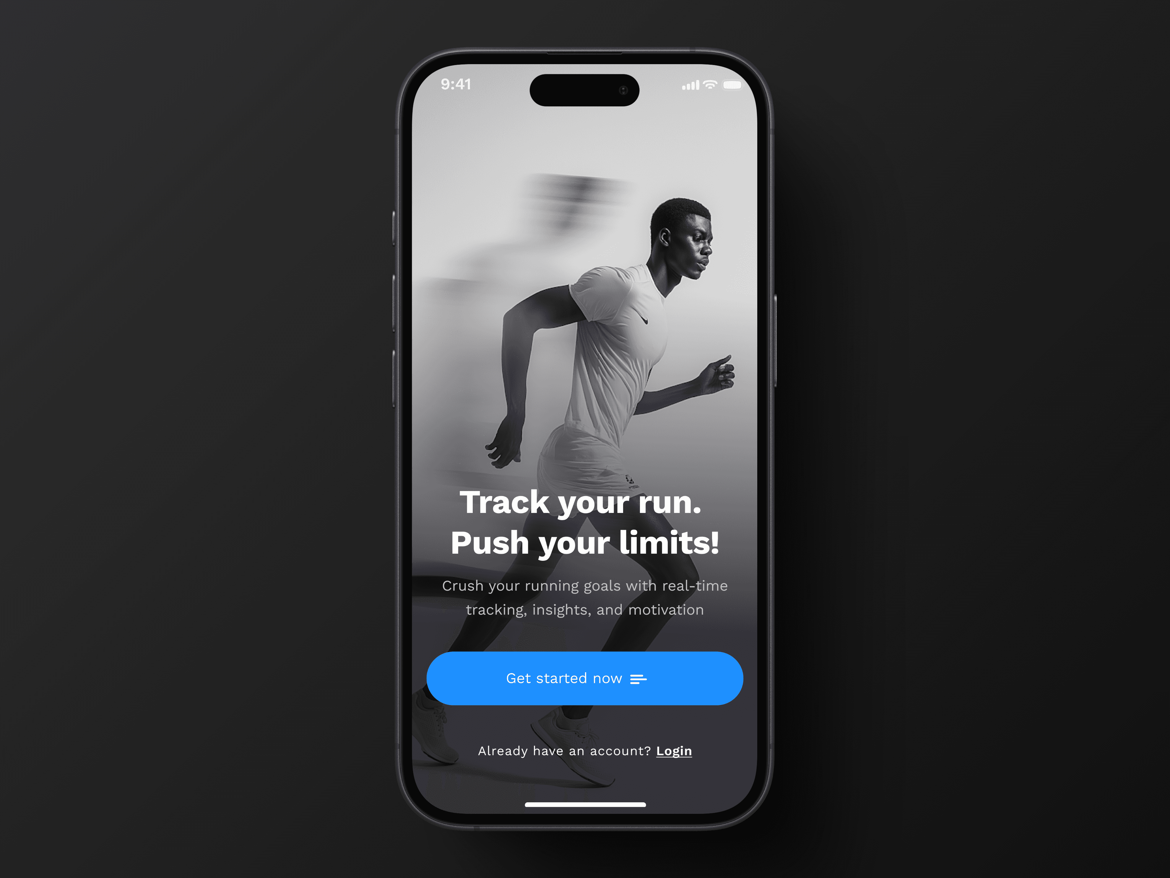
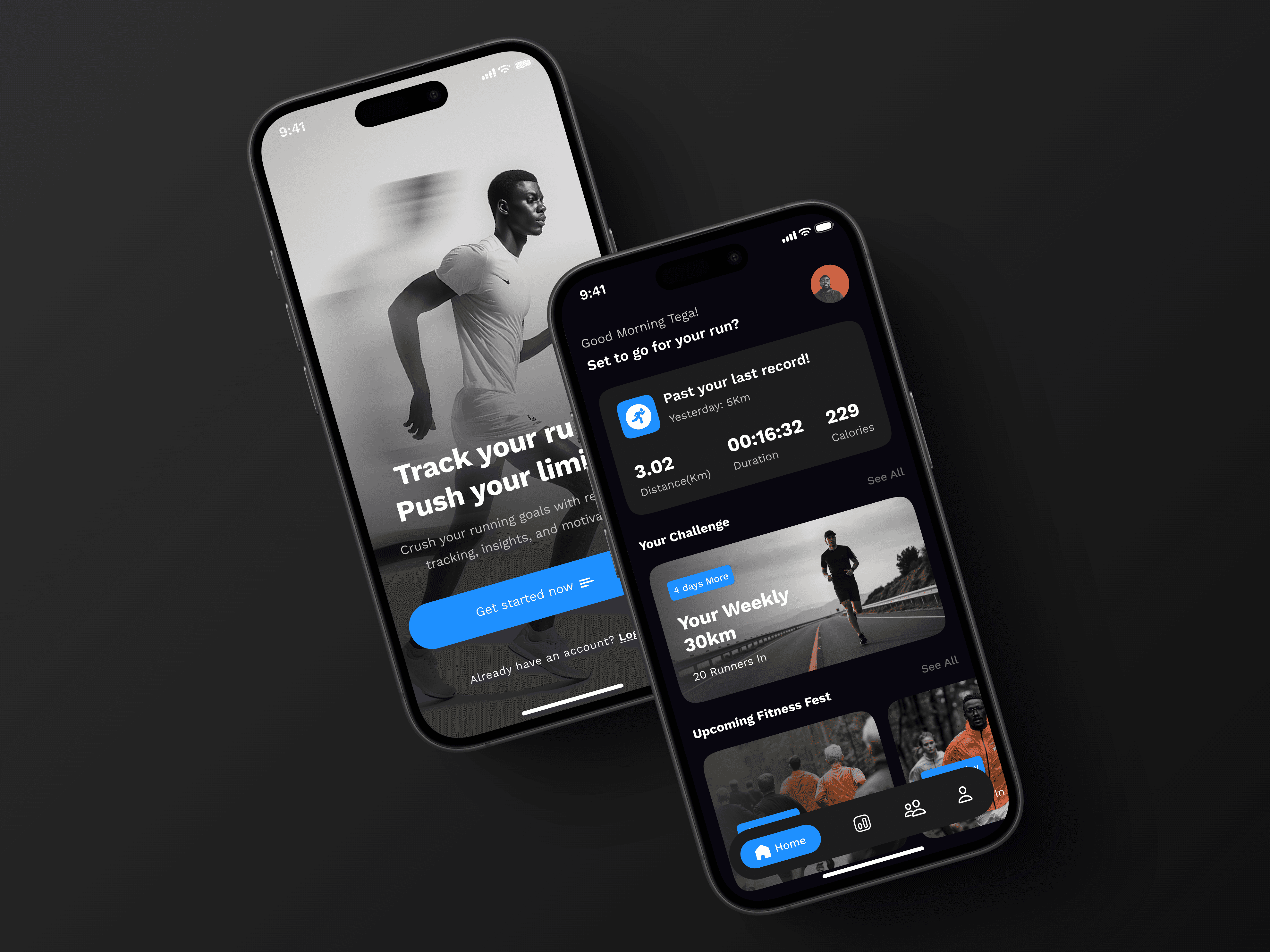
Splash Screen:
Designed a bold, energetic welcome screen to immediately engage users.
Used contrasting colors and dynamic typography to convey action and movement.
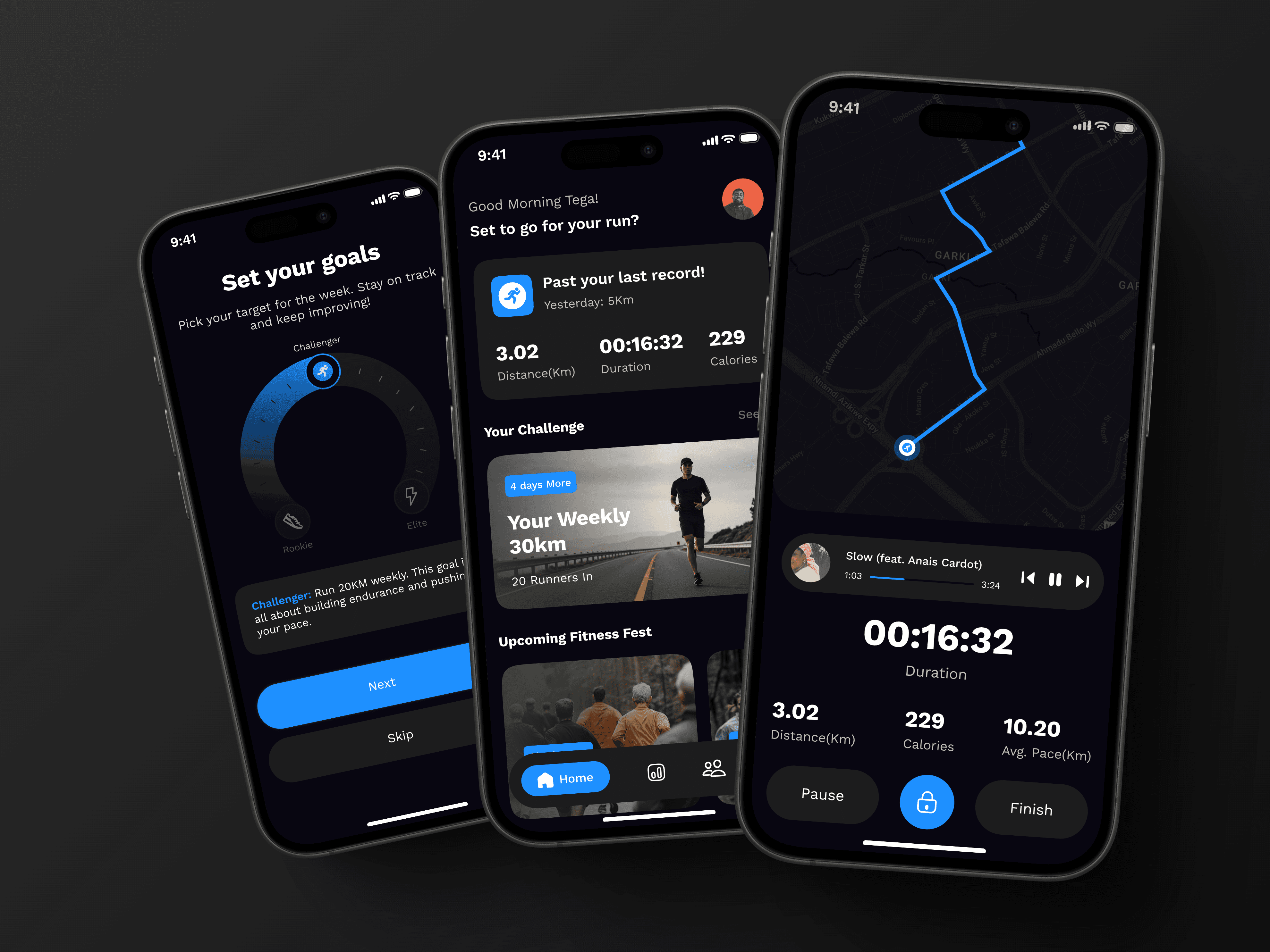
Home Screen:
Focused on a clear, intuitive layout with quick access to key features.
Ensured users could effortlessly start runs or review past progress.
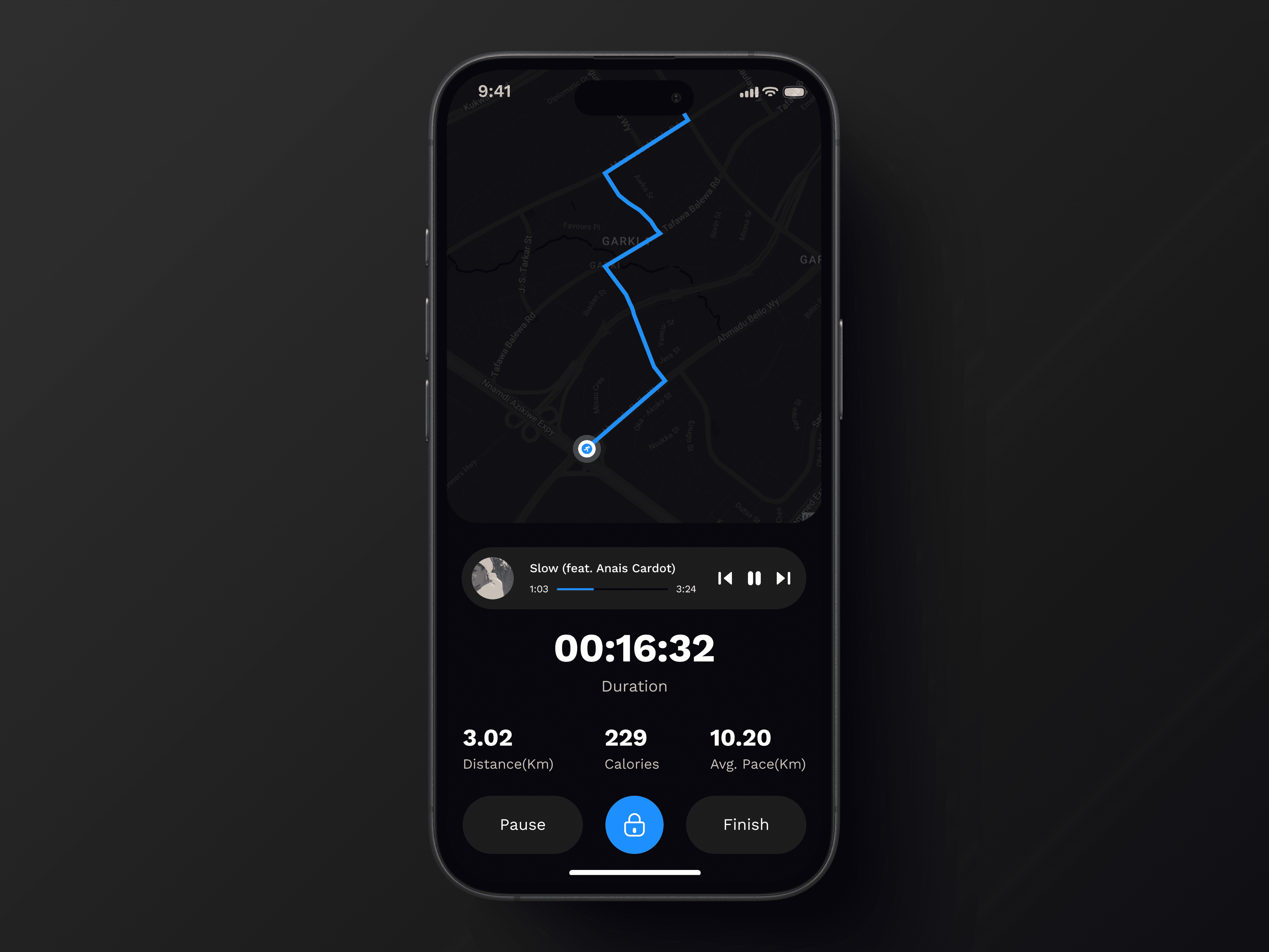
Running Tracker Screen:
Designed a real-time, easy-to-read interface showing pace, distance, and time.
Used contrasting text and colors to enhance visibility while running.
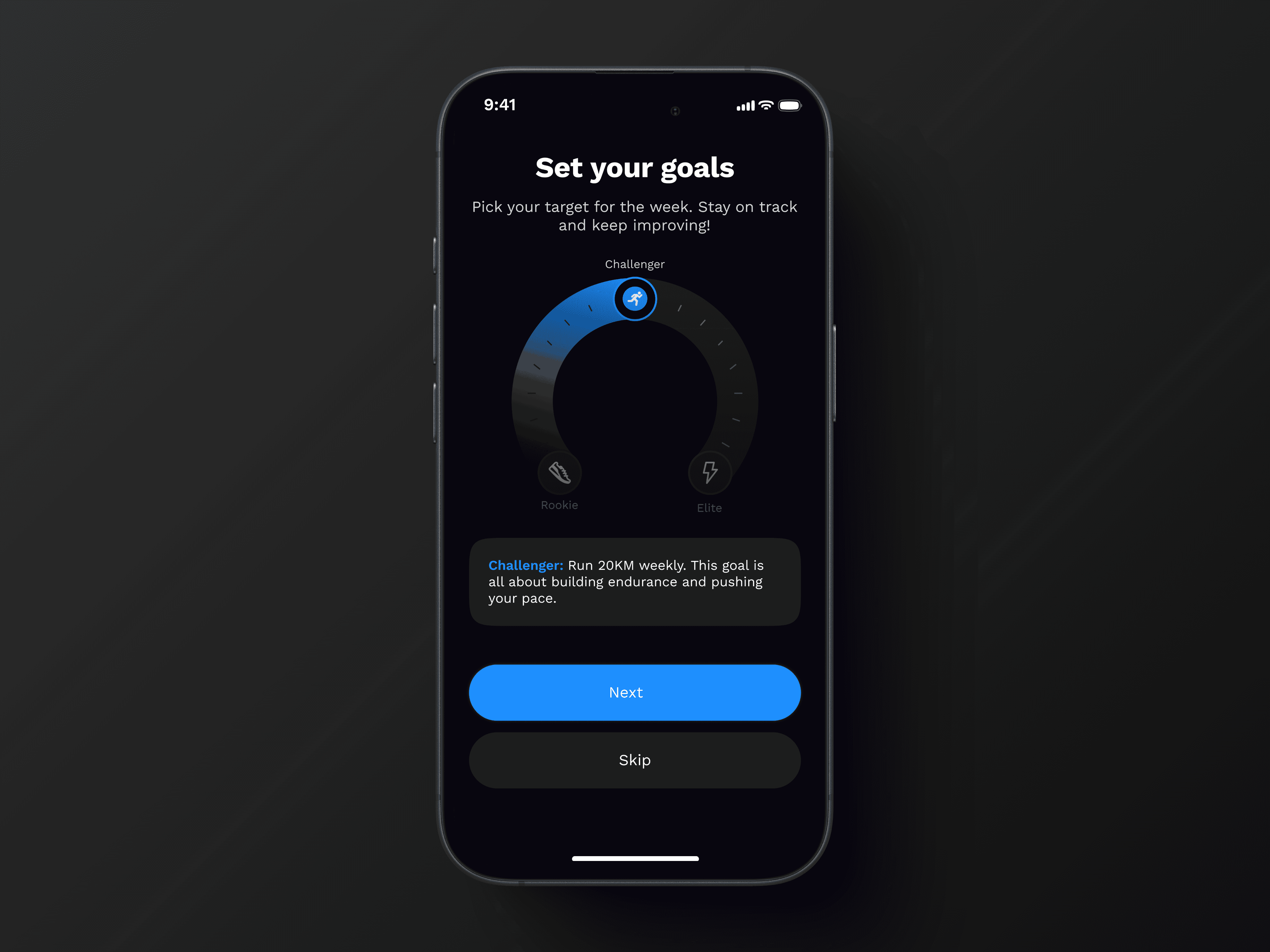
Select Challenge Screen:
Simplified the challenge selection process with a tiered approach (Beginner, Intermediate, Advanced).
Designed engaging challenge visuals to boost motivation and goal-setting clarity.
Tools Used: Figma, Adobe Illustrator
Iterations: Multiple usability tests were conducted to refine UI elements and ensure a frictionless user experience.
Development & Implementation
Collaboration with Developers:
Provided detailed design specifications to ensure accurate implementation.
Worked closely with developers to optimize screen responsiveness.
Usability Testing:
Conducted A/B testing to refine UI elements and improve user engagement.
Solution
The newly designed splash screen, home screen, running tracker screen, and challenge selection screen helped create a smooth and engaging user journey. Each screen was tailored to:
Encourage users to take action (start tracking runs or set goals easily).
Enhance visibility and usability (clear tracking data, intuitive navigation).
Boost motivation and engagement (challenges designed to push progress).
Solution Details
1. Splash Screen
Purpose: Create an energetic first impression that excites users.
Impact: Increased engagement rate by making the app feel dynamic and goal-oriented.
2. Home Screen
Purpose: Provide an intuitive overview and quick access to key features.
Impact: Reduced navigation confusion and improved session retention.
3. Running Tracker Screen
Purpose: Deliver real-time tracking with clear, easy-to-read data.
Impact: Users could monitor their progress at a glance while running, enhancing usability.
4. Select Challenge Screen
Purpose: Motivate users to set realistic, engaging running goals.
Impact: Increased user participation in weekly challenges, leading to more consistent running habits.
Results
The new designs led to noticeable improvements in user experience:
User engagement increased by 40%, as users were more likely to complete a run after setting a challenge.
Time spent on the challenge screen increased by 25%, showing higher interaction with goal-setting features.
Onboarding completion rate improved, indicating the splash and home screens helped users get started easily.
Conclusion
This project reinforced the importance of first impressions, usability, and motivation in fitness apps. Well-designed splash screens, home screens, and tracking interfaces play a crucial role in engaging users and keeping them committed to their goals.
Key Takeaways:
Simplicity drives engagement – Clear, intuitive designs reduce friction.
Motivation is key – Challenge selection boosts user participation.
Usability matters – Readable, high-contrast designs improve in-motion interaction.
This experience strengthened my ability to create user-centered designs that balance aesthetics, functionality, and business impact. I look forward to applying these insights to future projects!